


New on LowEndTalk? Please Register and read our Community Rules.
All new Registrations are manually reviewed and approved, so a short delay after registration may occur before your account becomes active.
All new Registrations are manually reviewed and approved, so a short delay after registration may occur before your account becomes active.
Would like to receive some comments about this design
 a-super-random-user
Member
a-super-random-user
Member
in Reviews
I'm working on a new website (wip) and would like to know your ideas about the current design.
Thank you

Comments
Defenitely not a fan of the design, it just doesn't fit for sections, it makes the whole site look rotated, might also be because it isn't made imo for this type of design. Also you get a scrollbar on the x-axis now, might as well put that on overflow hidden.
Red on green is a color scheme, also some breathing for the text would do better.
Edit: Also for highres displays (I'm on 2560x1440) the design kind of 'breaks' at the navigation.
My neck hurts. Not a fan of slanted containers.
Thank you @quinten, I'm working on the top shelf atm. Our focus was to build something simpler that goes with < > shapes. Top shelf was designed using css while other skews designed using svg's. (experiment) Now changing top skew to svg as well.
Sorry to hear that. However, as I've mentioned on the previous comment, focus was to build slanted boxes that goes with < > shapes.
Its not about how its made (using svg or CSS), as long as it does the job (Design wise).
If I were you I'd find another way to redesign this concept. What about having only the header rotated in like that? It just seems all a bit too much atm.
I hope that helps!
SVG does the job quiet fine. I've updated it on localhost. As my external lcd went bad I couldn't test it on that resolution.
It's not just the header. All colored boxes are designed using same method.
Thank you for spending your valuable time to review this design. I highly appreciate it.
It's a nice idea to go with the < > shapes but it makes my head a bit dizzy... Idk why but my eyes want to think it's a horizontal line and not an angled line.
Maybe fix the angle so those two match each other because imo it's a bit strange.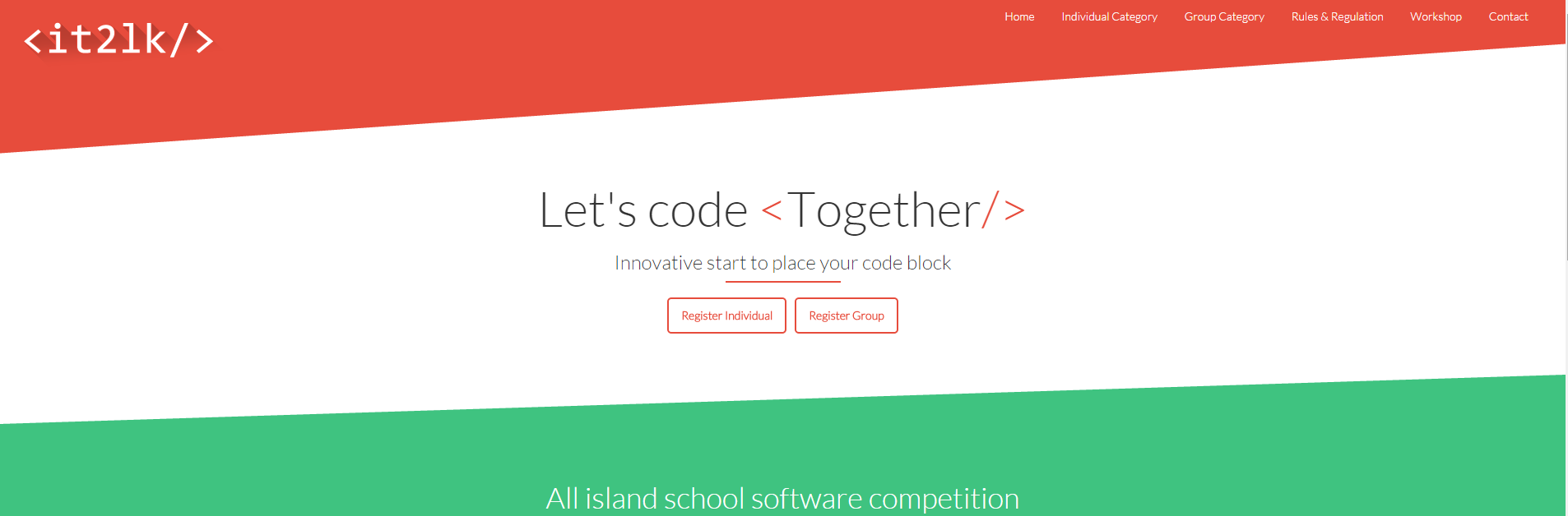
Oh, I can scroll horizontally (there is a vertical white bar on the right), you might want to fix that.
I've fixed it by tilting my monitor, but now the text is slanted.
Already working on it. It was caused by using two different techniques as tests. Fixing it will resolve dizziness issue as lines get parallel.
Thank you @TheLonely , I haven't noticed it on this screen.
Thank you for taking your valuable time to review this design. Much appreciate
It always works. I'm using the same technique to design this website.")
Ha Ha... Didn't noticed that. Go Hungary ! (btw, I'm from LKA)
i like it. looks good")
Thank you for your comment.
BTW, Whole designing process took less than 5 hours.
Despite I don't like non-standard look, I like this one. Good use of non-parallelalism!
Not sure about color choice for this type of service. Also, I would doubt red on green.
"Let's code " part is about perfect.
It's a design I haven't seen ever before so it does this site looking more special.
Though, I would remove the horizontal lines (I mean these which go f.e. through the top of the green section, at least with Chrome on Android) - if possible, I'm not very familiar with html, when I "write" a html it looks like one of the first websites out there.
Fix the navigation menu! other than that it looks good!
Not a fan of the slant or aqua-puke color, but otherwise looks good.
Can you please point out the error with current menu. Thank you.
I'm really happy to hear that. Thank you for your comment.
Yes. After spending some adorning time. I felt the same. Need to find a matching swatch.
Adopted from one of my previous publications. "HTML for Ordinary Level students. (Language was Sinhala)"
Thank you for your comment. I would certainly change the color swatches.
Style was created by an accident back then")
I've also tested this out. Seems like there are few more things to be touched with the mobile view. Thank you for your comment.
I actually like those lines on Android, makes the design easier on the eyes (because now my head doesn't think the tilted lines are horizontal)
It seems like I may keep them for a while.") It's 5.28AM Here and busy overnight was finished. Few documents and project proposal was prepared. (Sponsors are welcome)
It's 5.28AM Here and busy overnight was finished. Few documents and project proposal was prepared. (Sponsors are welcome)
This is a all island coding competition for school students (age 20 or below) who are currently living in Sri Lanka.
I like that it's responsive. I'm undecided on the slants, but overall really clean work, nice!
The slants are fine with me, but I don't love the red icons on the green background. Why not white?
Slants look okay. If using for long periods of time would start to trip me out.
Thank you. There is bit to work with responsive yet.
Already changed few colors. Using white won't emphasis them. Red is the best one so far
Ha Ha. Glad to help")
slants are a bit disorienting and makes it hard to focus on the site.... I love the though
Point taken. Thank you. But they (I'm developing this site for free of charge) needed something that goes with code blocks.
You explained why I liked the </> part. That is most important message of the whole site (call it CTA), it stands out with simplicity and code related sign </>. For that matter all that sloppiness) and disorientation is a good thing. Good job sdglhm! I don't know how you made it, whatever intuition). I would say there's even something subconscious in there. For that matter, red on green is fine. ..... I gotta steal some elements from you)))
Its pretty cool and unique
It doesn't annoy me how its slanted at all, but it might to some people I guess
Also doesn't like red icon on green background, why not try yellow? something like #e0fc0c