


New on LowEndTalk? Please Register and read our Community Rules.
All new Registrations are manually reviewed and approved, so a short delay after registration may occur before your account becomes active.
All new Registrations are manually reviewed and approved, so a short delay after registration may occur before your account becomes active.
Looking for feedback for website template - WIP :)

Heya,
so being a rookie webdev, I attempted my first website template themed as "VPS Hosting Company".
This is how it looks like atm: redacted
Too simple, or good?
Anything missing except for TOS/Clientarea?
@MrGeneral
Thanked by 1MikePT

Comments
It looks like an ordinary template to me. I personally don't like a colour scheme and title font you use. The logo is fine in my book. I would also increase title's vertical paddings.
DDOSDDoSthe template needs a lot of work, keep working and adding features and when you think you have done a lot of features ask us to review it.
What don't you like about the color scheme? Well if I go for DDoS I would need to do the ULTRA FAST and BE HAPPY without caps aswell, otherwhise would look weird.
What features are you looking for? What are you missing? Also please note this is a WIP.
Well might be adding some company info, but then again isn't that too much for a simple layout? :P I mean like you had to acctualy scroll even more. I might be adding a href to an imaginary FAQ but as the site does not use a menu/multiple pages not quite sure if and where to add it. And on the same site I wouldn't presume a FAQ to be looking good especially as a FAQ will always be extended. Then the site gets quite crowded and it takes some time until the visitor scrolled through the page.
I would go for too simple. Here's some things I would to different:
That's all my opinion though. Maybe I'm just a tasteless cunt.
$GenericHostingSite 101
Changelog:
Roadmap:
Just put the changes live for you to see^^
I acctually wouldn't want to change bitcoin/PayPal/Mastercard logos but I may just try it to see how it looks :P
Is it my eyes or... the brand name and logo doesn't seem very centralised.
Just checked and H from Happy is 704px from the left side and the G from Hosting is 708px from right side. And I am using
img class="center-block img-fluid m-y-3 text-xs-center" src="logo.png">
http://adventurega.me/bootstrap/
Umm... It's not very responsive. Sometimes text formatting just quits...
https://s32.postimg.org/6diis2khx/zrzut_ekranu3.png
live version?
Click
@Ympker good work keep it up btw that html encrypt a little funny")
HTML encryption. What's the world coming to?
encryptworld
Haha thanks will keep improving it tomorrow")
Too tired today xD
let us know the update
Good first start, but it would be too simple for a web hosting business, or any business for that matter.
update?
I was busy yesterday (had a job interview) and today I am out with friends so most likely will be pushing an update tomorrow.
@miklos just letting you know that I will be busy this week and most likely wont push any update within that time frame in case you were waiting. Will pick up development asap though^^
Hi!
It's nice to see you doing that website!
So, my feedback, for now:
Very incomplete website as you're surely aware :P
Logo is good enough. It's actually funny and different, so that's good.
Lettering below the logo is horrible, you should change it.
You miss a real header there.
You need to improve your footer.
Give some color to your website!
Note that:
Nowadays minimalist templates are getting our attention, but still there is a lot of work to be done :P, you're doing great though!
Heya!") Will get to it asap i have the time^^
Will get to it asap i have the time^^
Thanks for your feedback mate
Sure thing, take your time.
For the record, our main website isn't even ready... And we're using a template. So, no judgements here. :P
If you are interested in the source code simply use Google Dev Tools "inspect".
The encryption only works for those who do right click => View Source :-)
ok
You can right click and chose inspect element and you can see the source including the CSSs.
Now I like your logo, the letters are kind of weird, make one page all in included, menu header and footer, concentrate in make the page SEO friendly, minimize your JavaScript and CSSs, look at the position that they will be loading, this is a big for search engines, it is not all about the design.
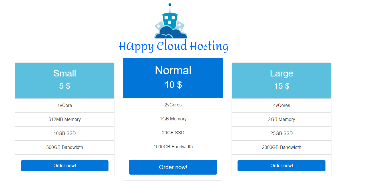
Regarding the design, the center offer is always bigger than the others, you should choose to make all the same and when you roll the mouse over it becomes bigger. Find a small banner to put over the offers to make one of them "the best deal", kind of red or yellow one.
Keep the good work and post your progress.
Update?
Hello @Ympker, you can try adding some details: lines, borders, shadows, spacing, typeface, alignments.
Also, You should consider what information is more important and that depends about your target.
For example, just guessing now (something you should never do in real life): it's good to have your logo in the middle of the head, but maybe not as big as your package description. Maybe you should consider adding a paragraph about why you are different to other providers. The price could be more relevant than the package name also.
I've made some changes to the CSS for your live website:
Sorry about the logo :P You should use PNG for the opacity.
If you have a Git repository I can help you a bit.
Ouch, 3 months old.